Bank of the Philippines
After working with ABN AMRO, I had the opportunity to take on another banking challenge, this time on the other side of the world.
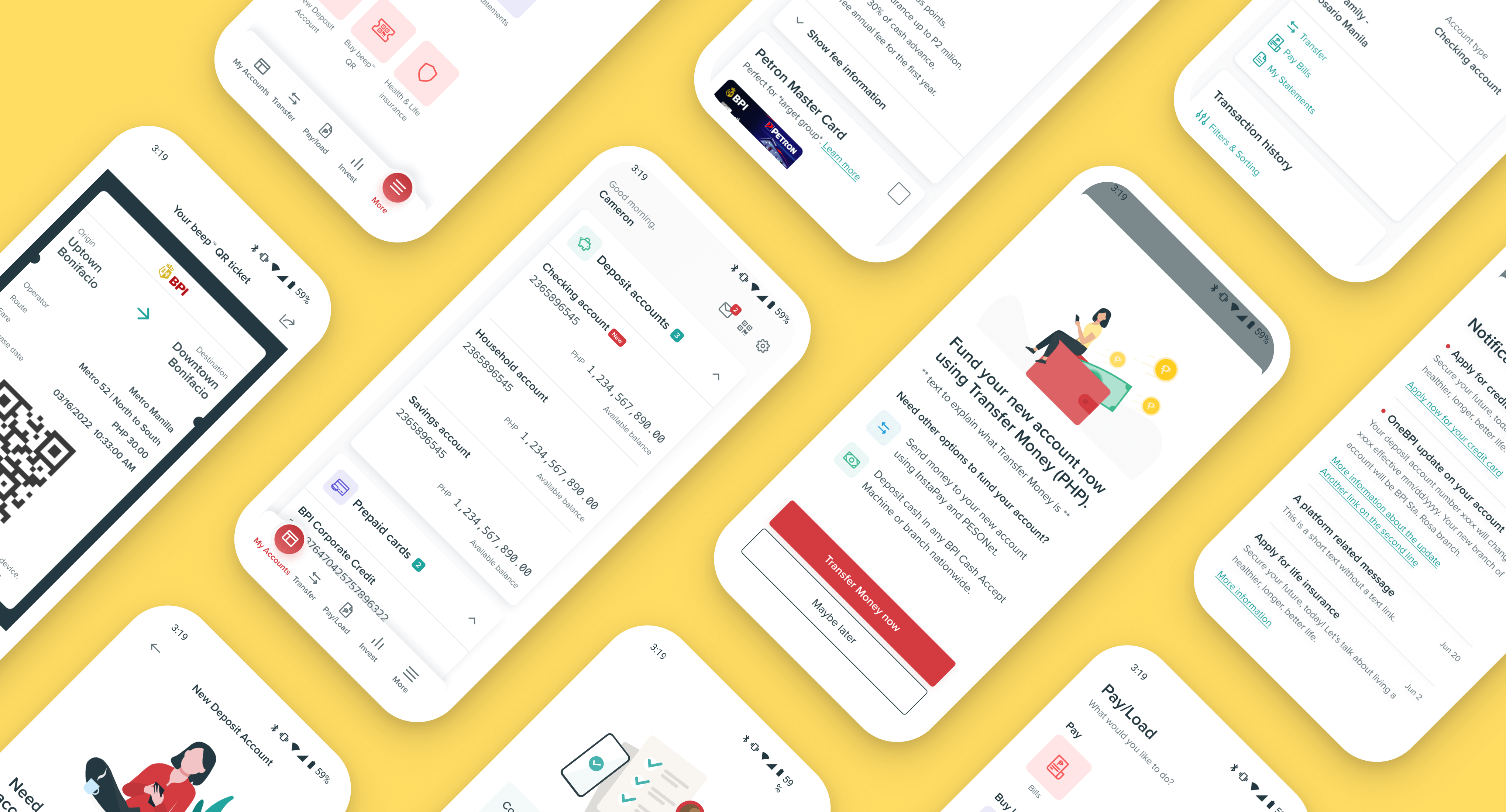
Bank of the Philippine Islands (BPI) is one of Southeast Asia's oldest and largest banks. Together with Mobiquity, I worked on redesigning its digital banking experience across iOS and Android.
From interviewing users and stakeholders to designing new user flows, refining the visual experience, and developing a design system, the project covered pretty much everything I enjoy about product design.
Role: Product designer
Focus: UX design, UI design, Mobile design, prototyping & testing, art direction
Agency: Mobiquity
Year: 2022
Award: Best Fintech partnership Philippines 2021
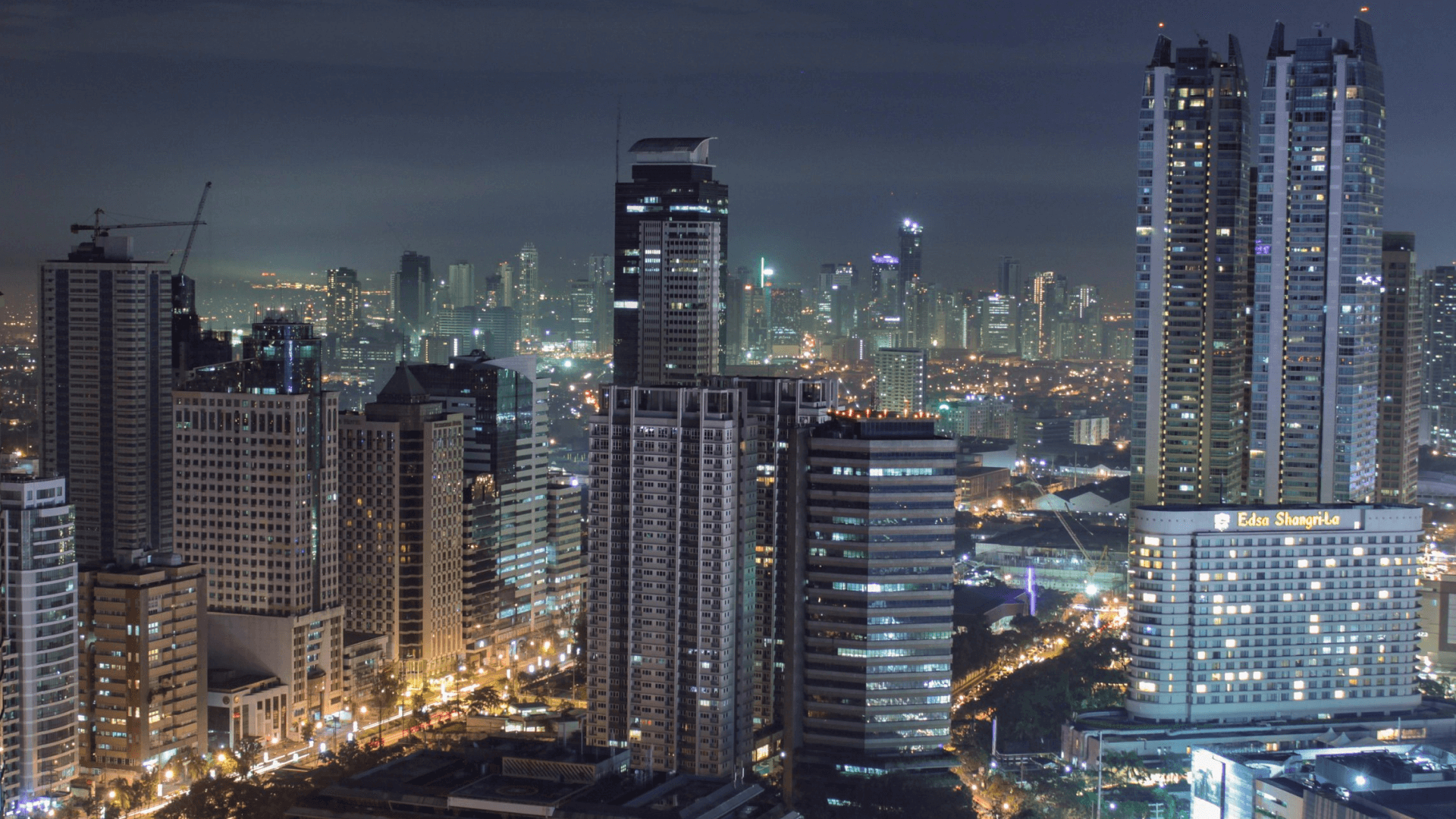
Making everyday banking feel effortless.
Banking apps aren't exactly known for being exciting. And that's fine. When you're checking your balance, transferring money, or managing your accounts, you mostly want things to be clear and easy to use.
Before diving into the designs, I conducted extensive interviews with users and stakeholders to better understand their needs, frustrations, and expectations. These conversations helped us identify where the existing experience fell short and what needed the most attention.
With those insights in mind, we explored ways to make everyday banking simpler and more intuitive. From organising information to improving user flows, the focus was on creating an experience that feels familiar, reliable, and easy to navigate.
The goal was simple: help customers get things done without having to think too hard about how the app works.
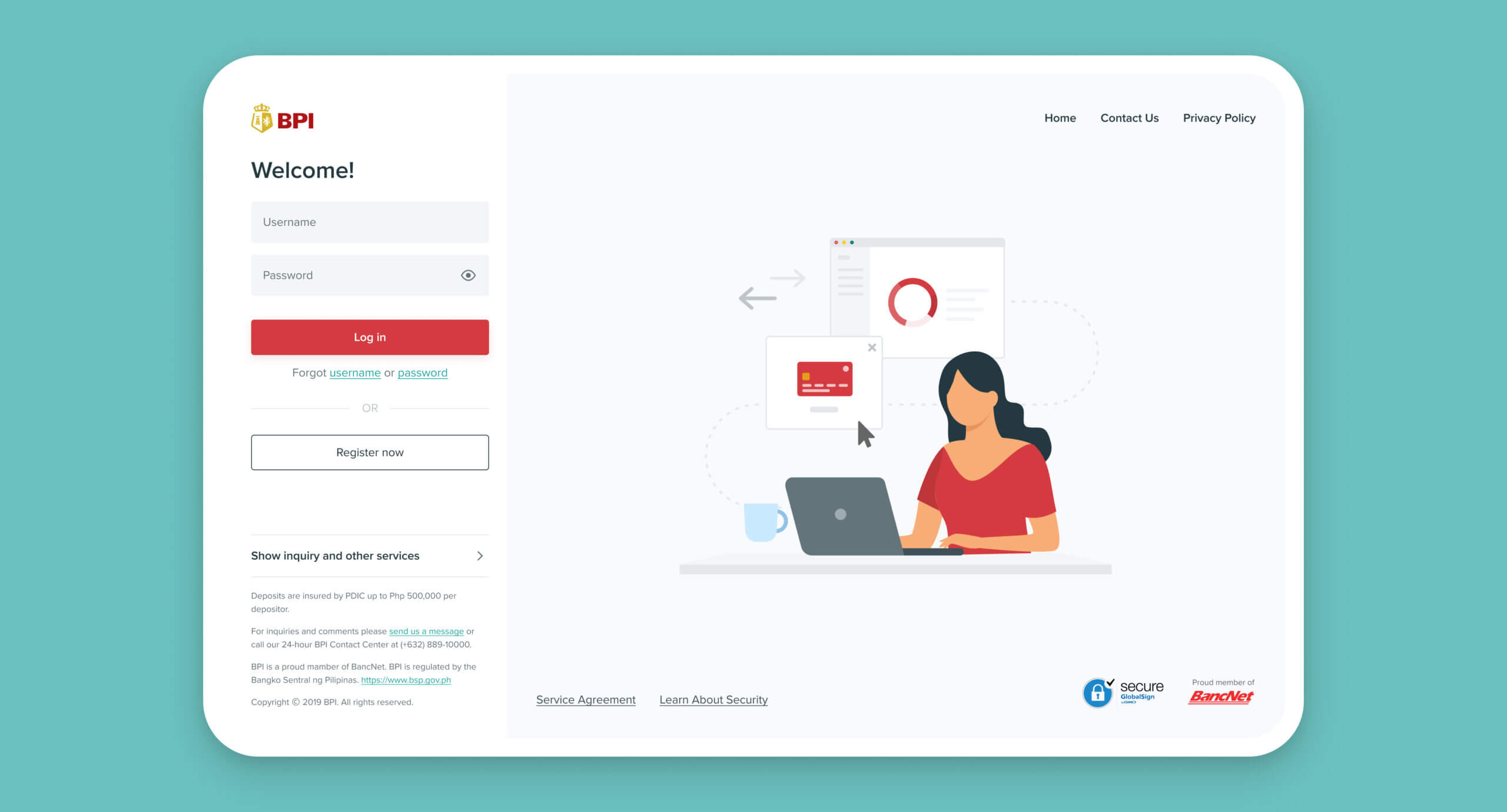
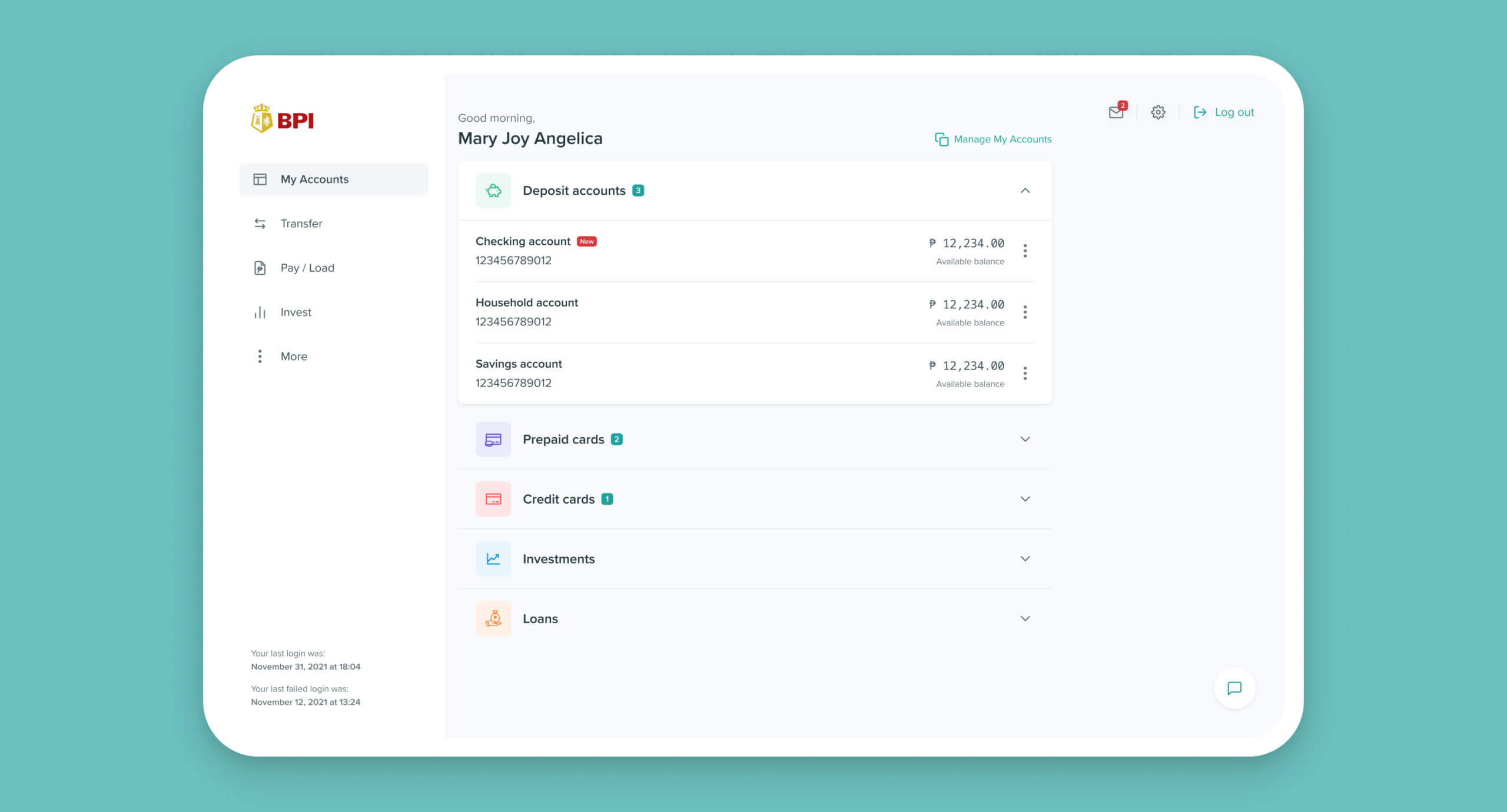
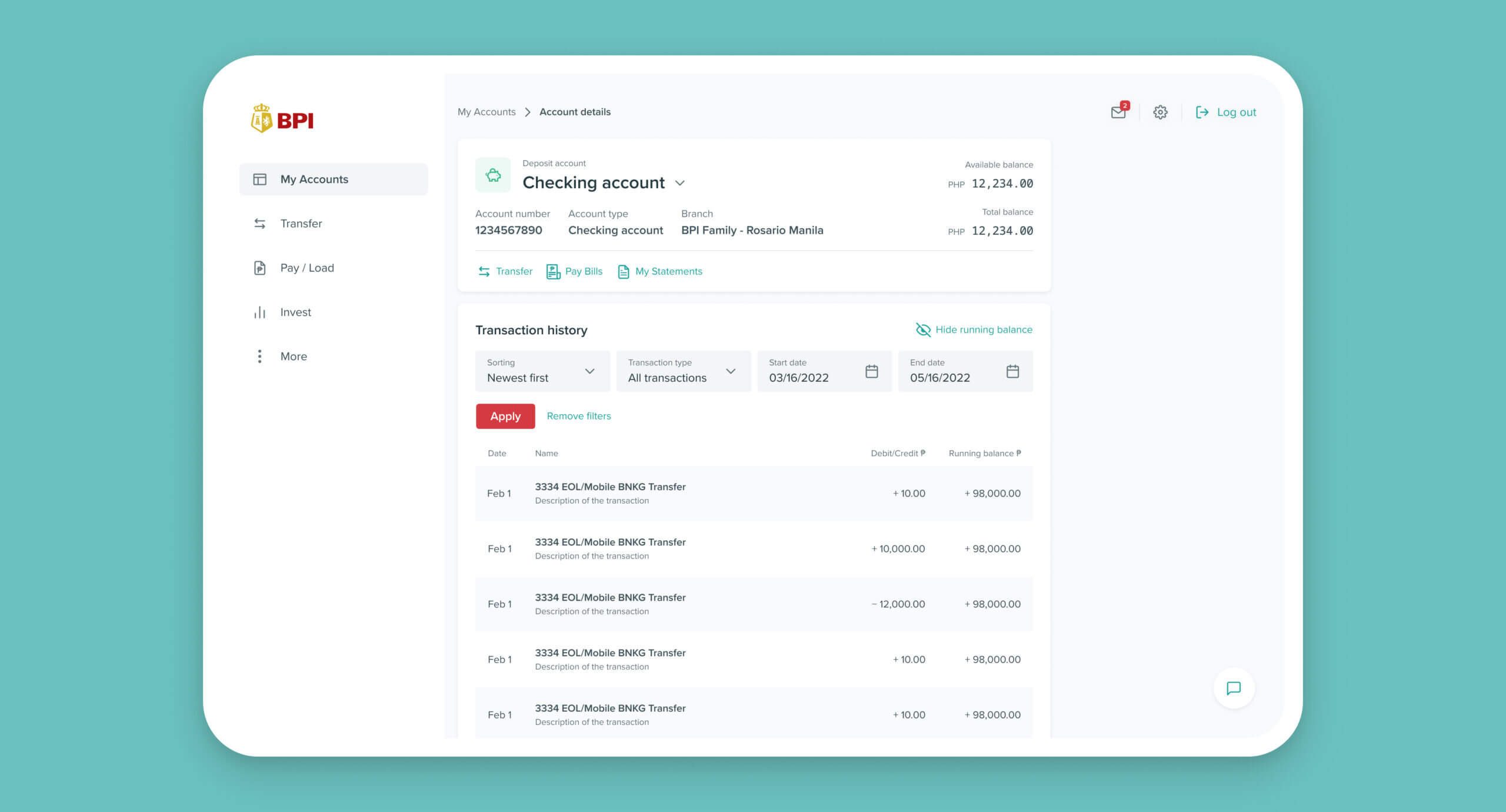
The grayness needed some color.
Of course, that doesn't mean a banking app has to look boring.
We wanted to bring more colour and personality into the experience, without distracting people from what really matters. Finding that balance turned out to be one of the more interesting design challenges.
Rather than adding colour everywhere, we decided to use it more selectively, especially at the beginning and end of user flows. This gave us room to introduce illustrations and more expressive elements while keeping the important screens clean and focused.
Creating a design system.
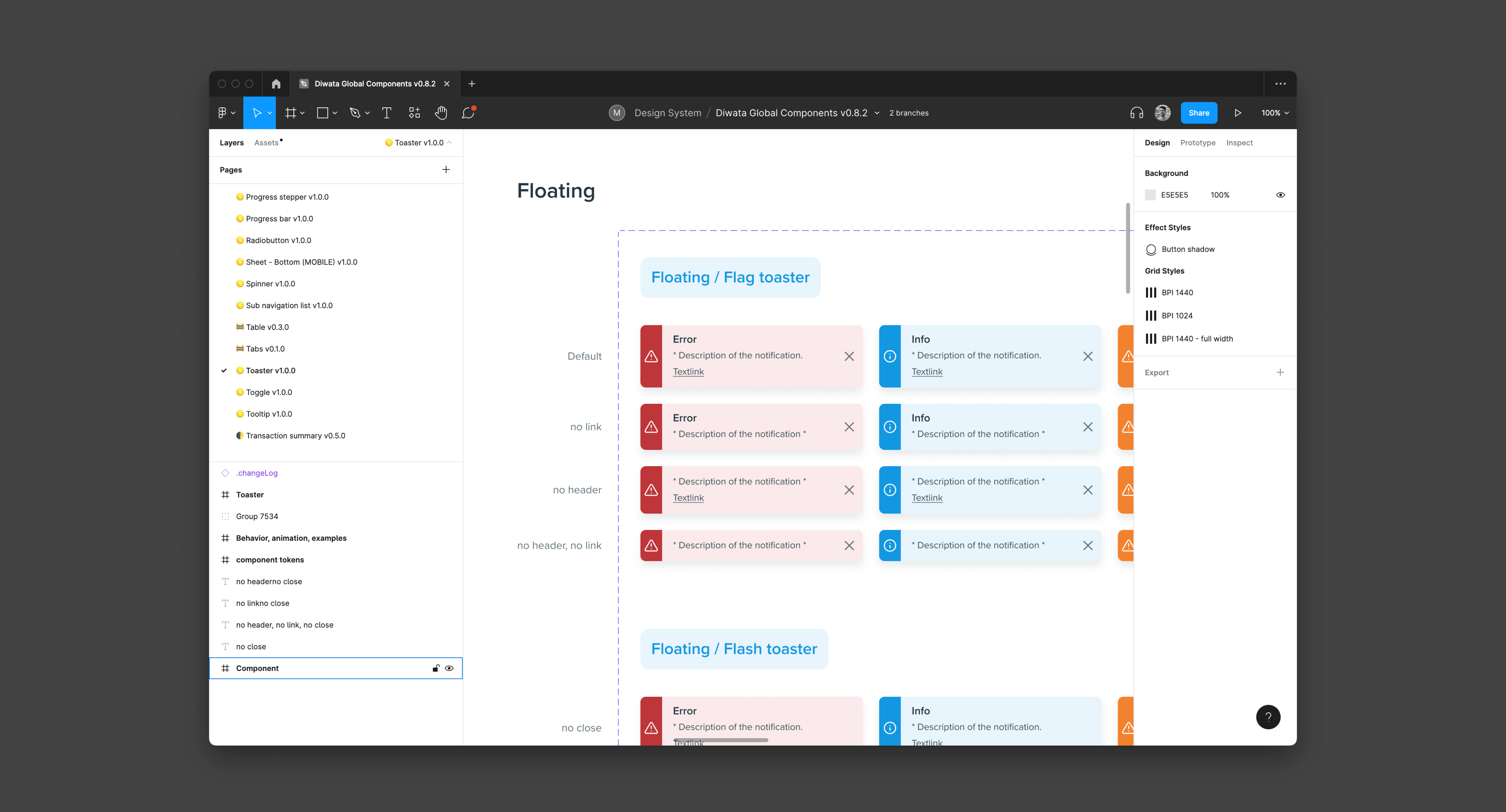
With five designers working on the same product, keeping everything consistent was essential. Especially since most of our collaboration happened remotely.
Alongside the redesign, we developed a design system to create a shared visual language across iOS and Android. We defined reusable components, visual styles, and common design patterns to make sure everyone was working from the same foundation.
This was long before design tokens and AI agents became part of our everyday workflows, so maintaining consistency involved quite a bit of manual work. From updating components to keeping different screens and platforms aligned, it required close collaboration and plenty of attention to detail.
It was a time-consuming process, but an important one. The design system helped us work more consistently as a team and gave the new banking experience a solid foundation to build on.
Final thoughts.
Working with an international team was an interesting experience. We quickly discovered that our ways of communicating, giving feedback, and making decisions weren't always the same.
At first, finding the right way to work together took some getting used to. We had to learn when to challenge ideas, when to listen, and how to make sure everyone felt comfortable contributing.
Over time, we found a way of working that combined different perspectives and made the collaboration much smoother.
It was a good reminder that designing great products isn't just about the work itself, but also about understanding the people you're working with.
Have a challenge in mind?
Whether you're looking for hands-on design expertise, strategic guidance, or a fresh perspective, I'd love to hear from you.