Qatar Museums
Qatar Museums brings together some of the country's most important museums, galleries, and cultural experiences. With a new brand identity created by Fabrique, the next challenge was to improve the visitor experience across these different institutions.
Together with Fabrique, I explored how visitors interact with the museums, from booking tickets and becoming members to navigating the different services. It was an interesting journey into the world of Islamic art, cultural differences, and surprisingly complex processes.
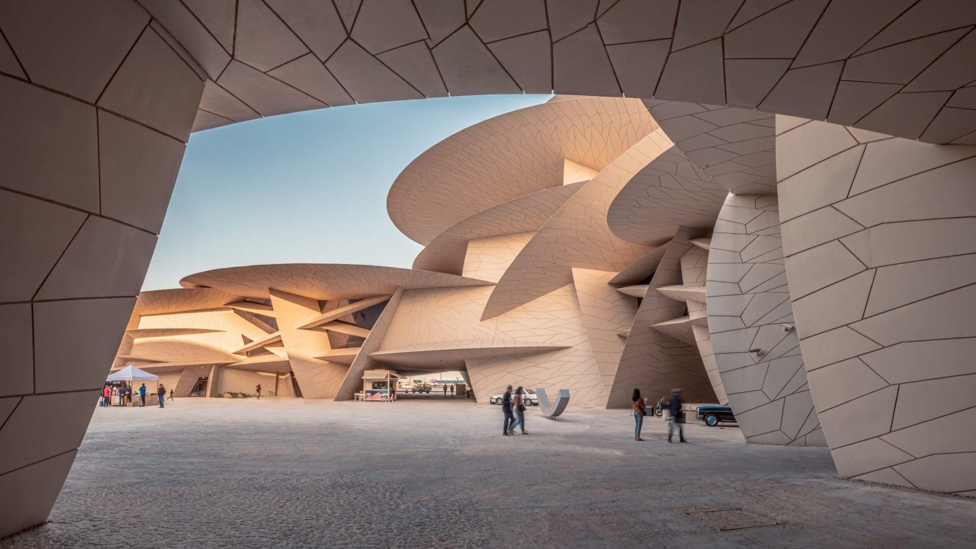
Consistency is king.
We've all heard the phrase "content is king". Well, in this project, consistency was king.
Qatar Museums oversees four museums and three art galleries, each with its own processes, communication, and ways of interacting with visitors. Even something as simple as booking a ticket could work differently depending on the institution.
Our first challenge was to understand these differences. Where did the experiences overlap? Where did they fall short? And what could we learn from each other to create a more consistent visitor experience?
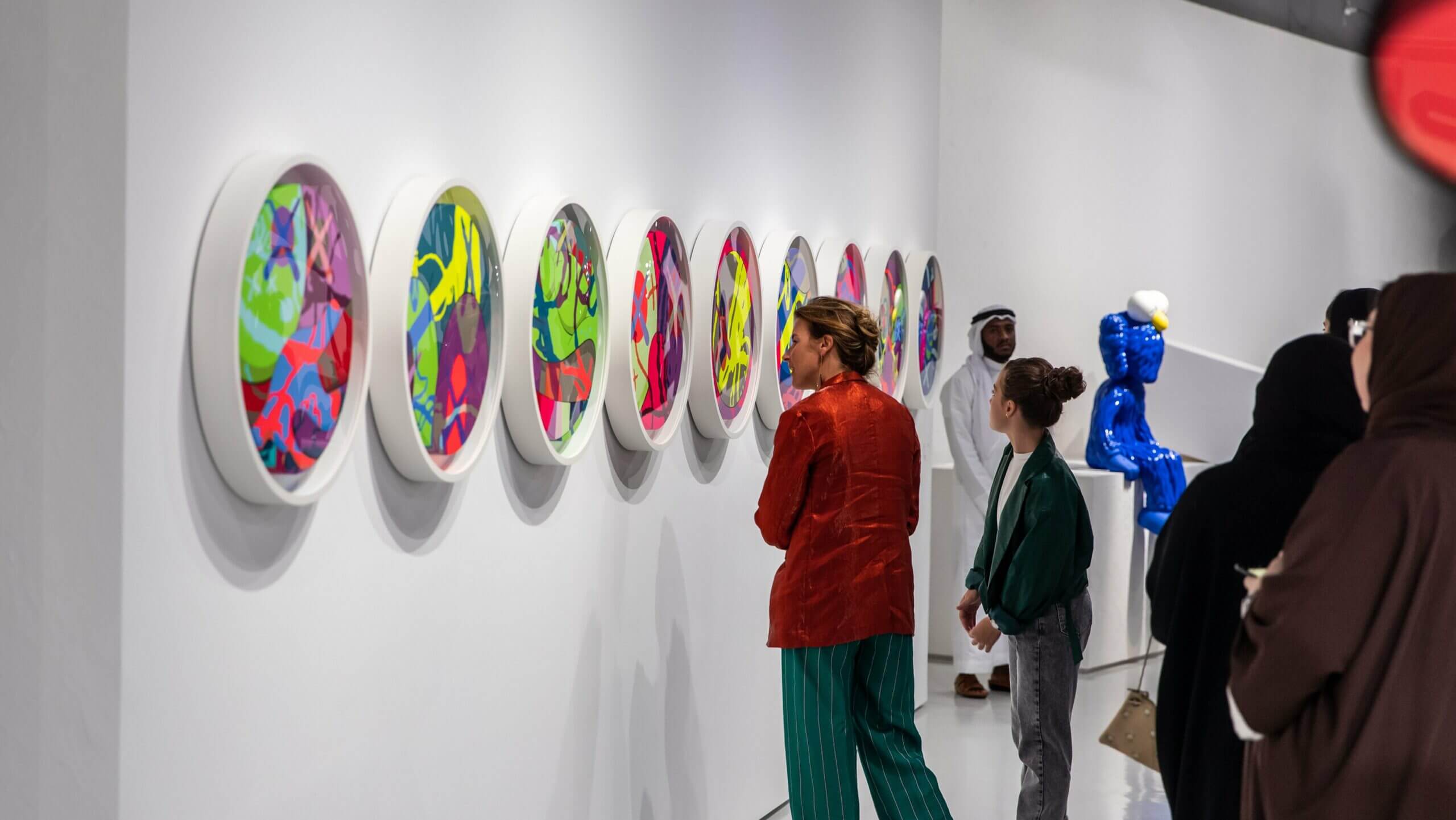
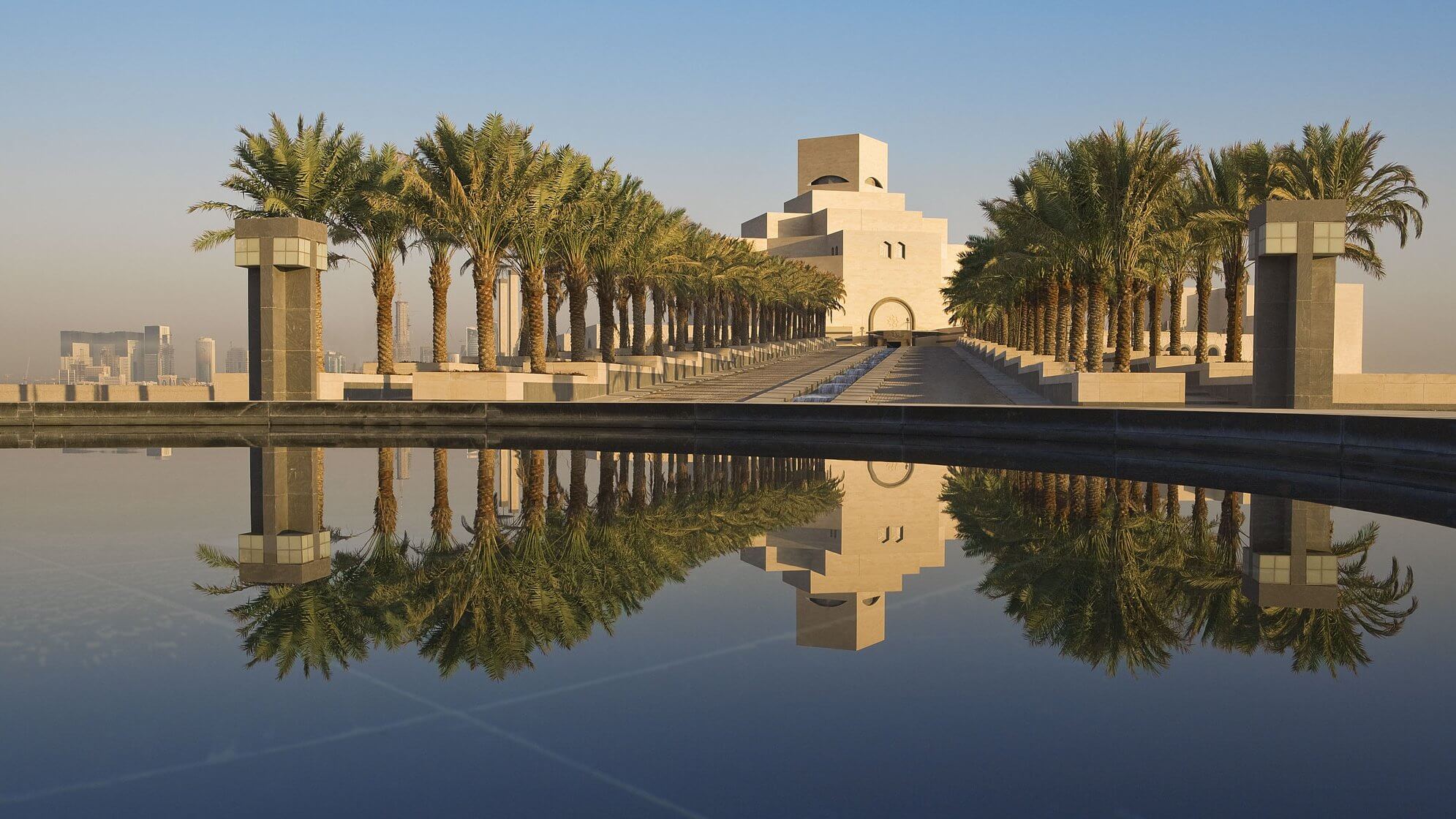
Making sense of complex journeys.
Before we could improve anything, we needed to understand how everything worked. I conducted extensive interviews with people across the different museums and departments to learn about their processes, challenges, and ways of working.
These conversations revealed just how differently things were organised, even when the visitor's goal was exactly the same. From booking tickets to becoming a member, there was a lot to untangle.
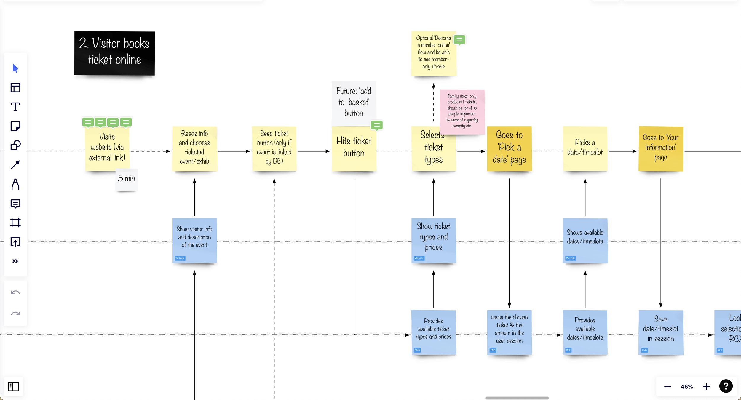
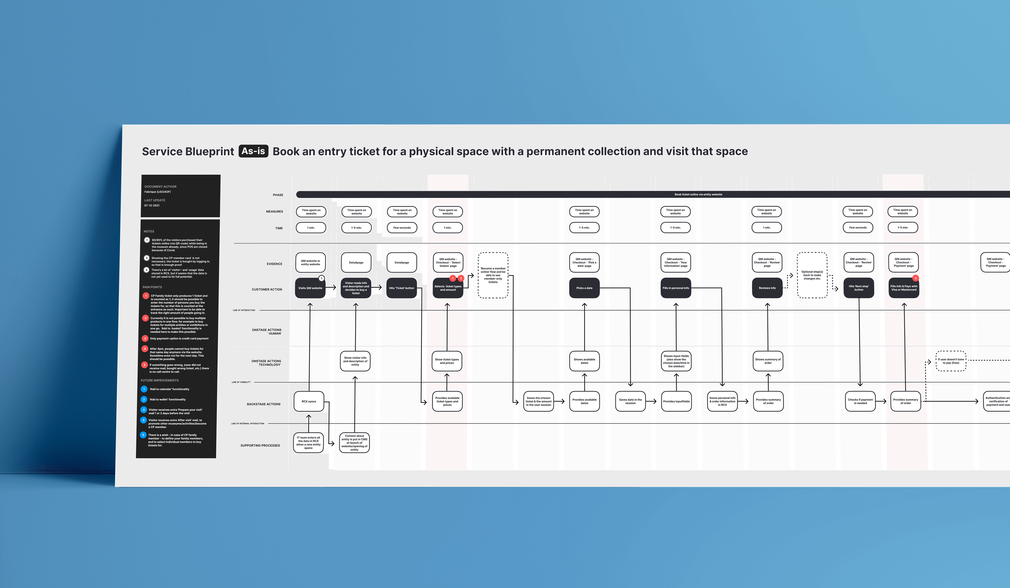
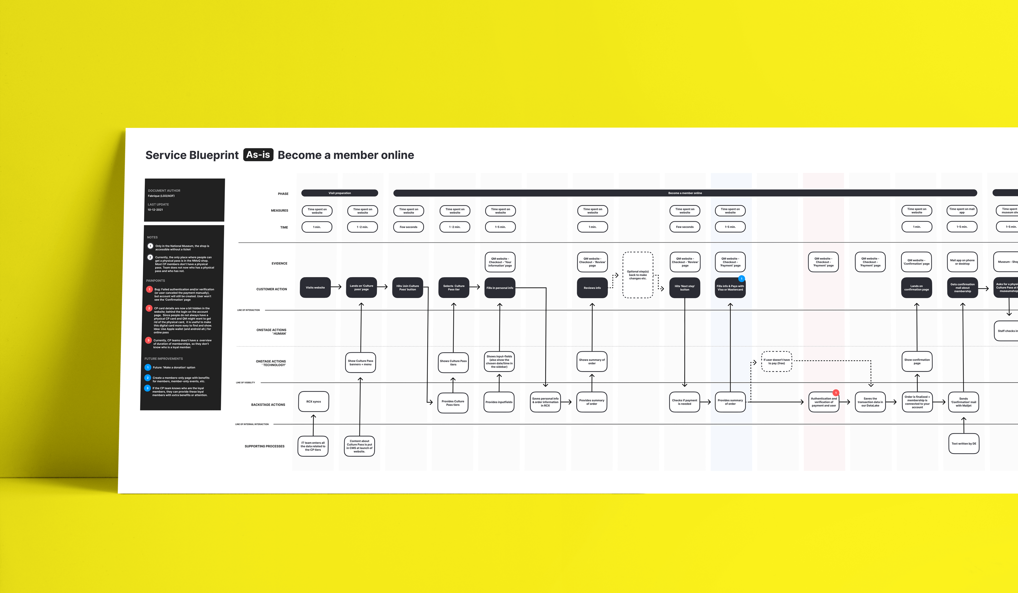
Service blueprints turned out to be the perfect way to bring everything together. Using the insights from the interviews, I mapped out the different steps, systems, and interactions behind each visitor journey.
We kept the blueprints visual and easy to update, so everyone involved could contribute, challenge assumptions, and build a shared understanding of how the museums operated.
Creating the foundation was the easiest part.
After conducting all those interviews and gathering the insights, turning everything into the first version of the service blueprints in Figma was actually the easy part.
The real challenge started when we brought everyone together to go through them. During these sessions, we discovered just how different the processes were between institutions, and how many small frustrations and missed opportunities were hidden along the way.
We used those insights to refine the blueprints, identify the most important pain points, and create a foundation for improving the visitor experience in the next phase.
It was a good reminder that understanding a problem together is often just as important as finding the solution.
Final thoughts.
What I enjoyed most about this project was getting the chance to really dig into the details of a user experience, far beyond what happens on a screen.
It's surprising how something as small as an authentication step or an automated confirmation email can have such a big impact on someone's experience.
And that's what made this project interesting. Sometimes improving a digital experience starts long before you open Figma.
Have a challenge in mind?
Whether you're looking for hands-on design expertise, strategic guidance, or a fresh perspective, I'd love to hear from you.